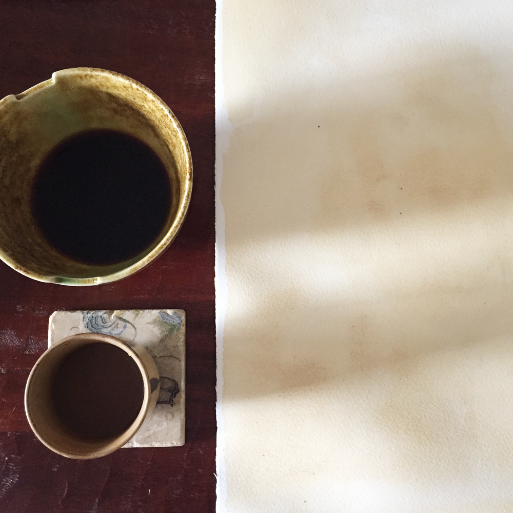
In photographing my jewelry collections, I haven't been completely satisfied with the background textures behind the pieces themselves. In product photography, every little tiny detail counts—and it counts for a lot! The photography is a vital piece in continuing the story of a brand.
Photography of the Simpla Collection in progress
In the realm of handmade objects, there is a world of difference in holding and feeling a physical thing versus seeing it in a photo on a computer screen. With jewelry, a less detail oriented photo may not capture the qualities of the stones and handiwork; it may miss the nuances of character and intention in the way a piece of metal has been hammered, or the indescribable depth a piece of labradorite or moonstone flashes when the light hits oh so right.
Final photo of the collection
Final photo of the Kyanite with Ruby necklace
The background sets the scene for this part of the brand experience, this chapter in the story. If I used a piece of gray slate or steel, how cool and modern the photo—and so the jewelry—would feel. A backdrop of fabric woven with a heavier thread gives a warmer and definite handmade look, but it's too heavy, and so it lends a look of less refinement than I'd like to achieve. A great amount of precision and planning is involved in the creation process of a piece and any detail that does not perpetuate these qualities must be discarded. That's my design philosophy anyway, and it led me to painting a gigantic piece of watercolor paper with coffee. Offsetting the seriousness of the design process with childlike fun is always imperative.
First I gathered my tools: coffee, paintbrush, and scrap paper. I like minimal setups.
Next I tested the strength of the color in relation to the amounts of coffee and water within the brush. With French press coffee, some "sediment" settles to the bottom of the cup and this gave me darker colors (and some grit).
Once I stepped over that small learning curve, I set out to cover my piece of 22x30 inch paper. It made me miss painting with watercolors, but I cannot get sidetracked with another endeavor at the moment!
So, you may wonder what did not satisfy me with the Simpla photos. For one, keeping the fabric from wrinkling, and thus ironing (both with a real iron and with Photoshop), is a job I do not wish to add to my plate. I'd rather spend that time building other parts of this wheel. White fabric betrays every speck of lint that floats over it and lands within the weave. I felt the crisp color looked too new for the story I am trying to tell. I'd like for the aesthetic to stir feelings of something more timeless and classic. I think I am getting closer to that with this stained paper that looks almost like windblown sand—as if you might find a necklace with gleaming jewels laying in the sand at the foot of an ancient temple, waiting just for you.
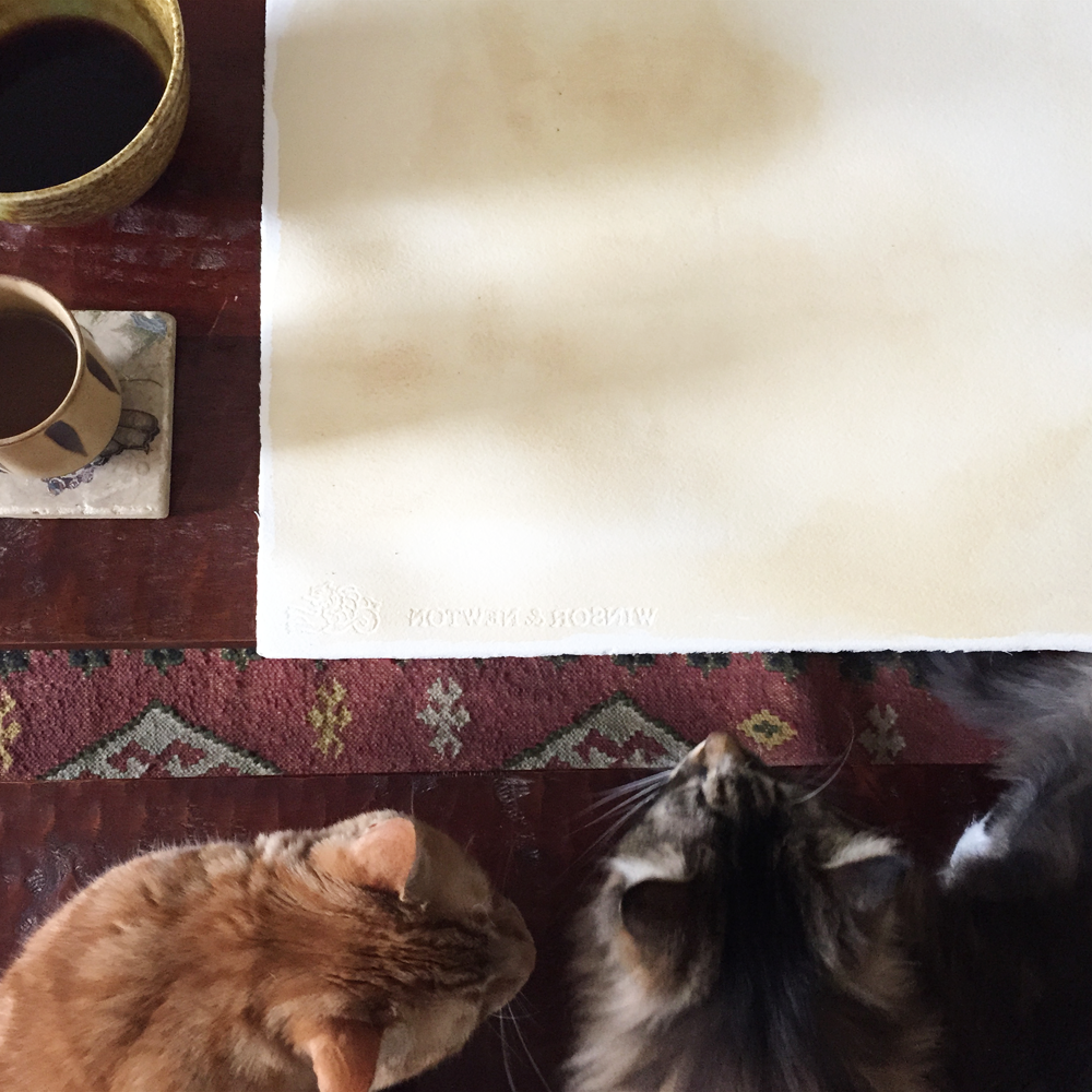
Hobbes is the boss around here, the Creative Director. His approval consisted of a sniff, a look that said Good, keep working, followed by his departure. Like any good director.
So what will the new photos look like? Let me finish up the collection I'm working on, Mare, and we shall sea! (Do you see what I did there? Oh I did it again.)


